Online Visual Design
This project is about creating a series of online visual designs based on the client’s desired style and analyses of the brand’s customer base. The process involves working with the brand engineer to create a banner that works for many websites and its logo and icon after the main style is confirmed.
Design Intent
There are two types of color schemes in Japan.
One is a very bright and contrasting color scheme, which is common in Southeast Asia, such as
Thailand and Singapore.
Another color scheme is the so-called Norlandi color scheme, which is a color with a lower
talent and a little bit of gray. This color scheme is more common in ancient Japan.
This time, the design client hopes to attract customers very quickly, and the customer group is
also in Southeast Asia. That is why they chose the bright Southeast Asian color scheme. Although
this color scheme can be a bit dazzling after a long time, it is a brilliant memory strategy in
the fast-browsing electronic marketplace.
Client Setting
Style requirement:
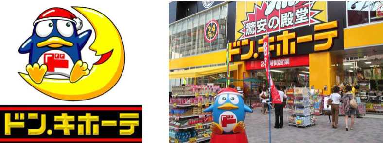
The client provides Don Quixote as an avatar template.
Color requirement:
Bright, high color saturation.
Target customers:
Southeast Asians who need a purchasing agent for Japanese products.
Reference image from customer:

Element Setting
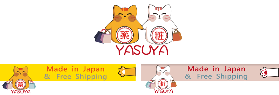
Japanese shop customers choose cats. I designed a smiley fat cat that beckons fortune.
Color Palette:
Southeast Asian customers prefer bright colors that still conform to the
Japanese style, which is the color palette I used for my composition to generate the desired
Japanese style.

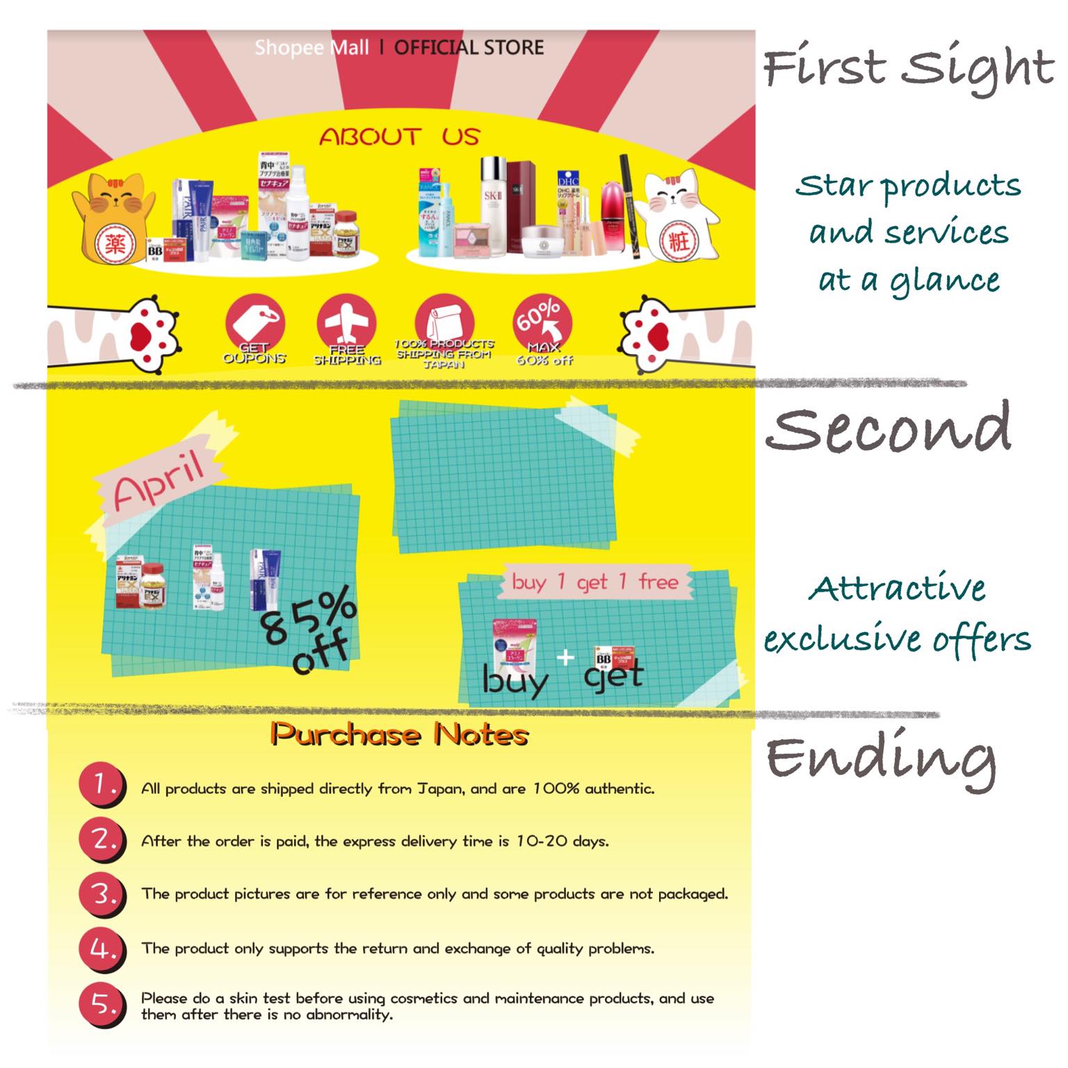
Most websites are presented with scrolling banners, but the engineer produces the effect with three prints. I use a visually pleasing visualization, i.e., three standalone prints that form a new image when put together.

Sub-brand Design
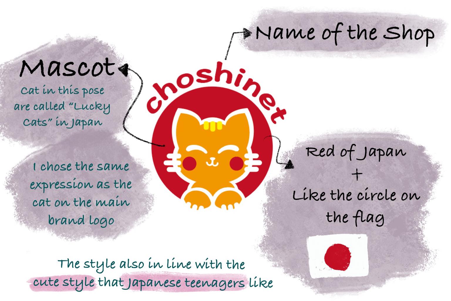
For similar merchandise, targeting young female customers. The style is in line with the cute style that Japanese teenagers like. Also, the shape and color of the logo originated from the Japanese national flag.
