Old Brand Redesign
This project is about designing an old brand that seeks to rebrand itself. The brief asks for some new logo and banner to create a brand-new sister brand with a higher price range for similar product lines and types.
Visual Transformation for Original Brand
The following are two new logos for the brand. One is for B2B e-commerce selling skincare
products, and the other is for a newly opened Spa place.
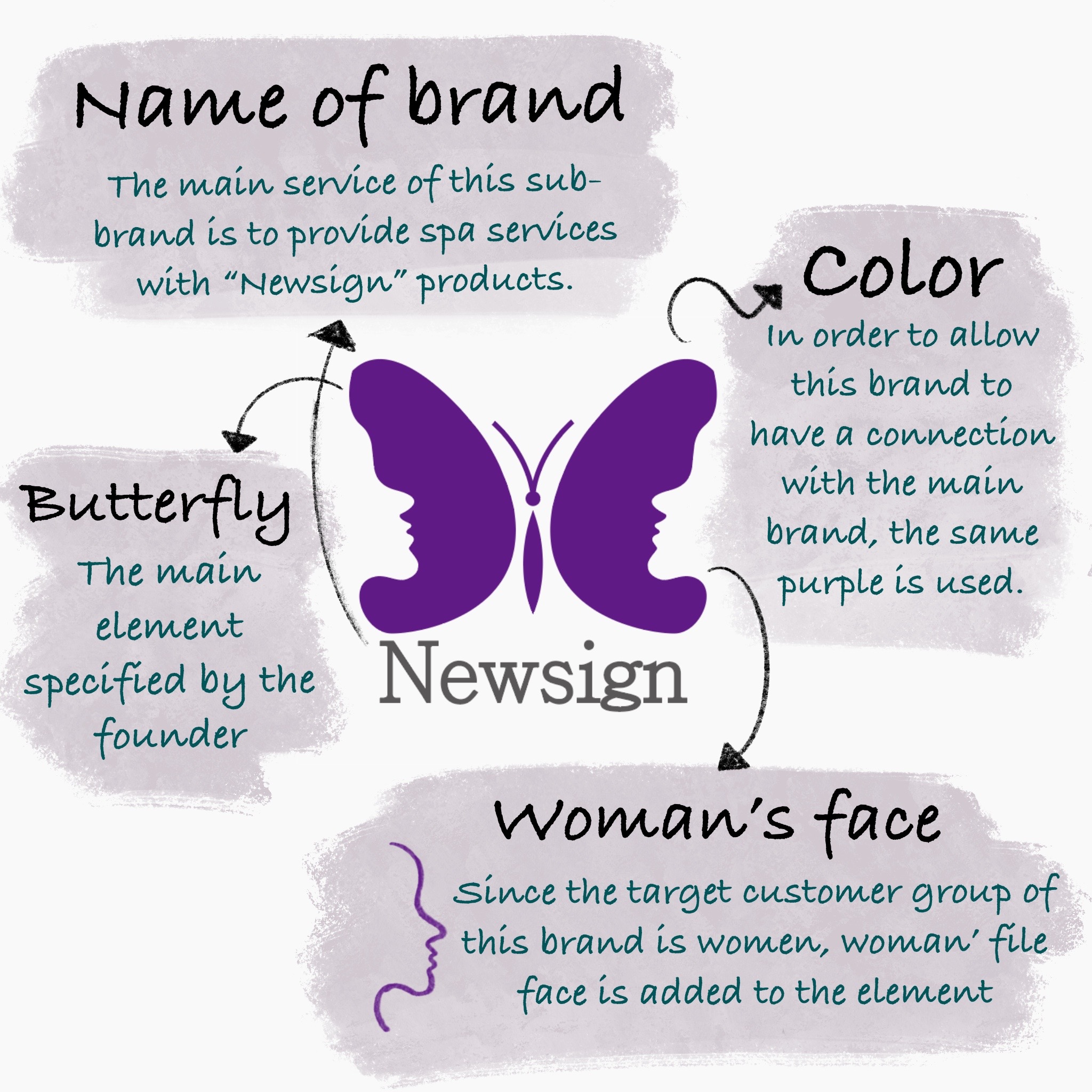
Purple is the brand’s original color scheme, and I chose to continue using this color not to
evoke a sense of unfamiliarity among the frequent customers. I brought together butterflies and
female faces because butterflies are the mascot for the original brand.
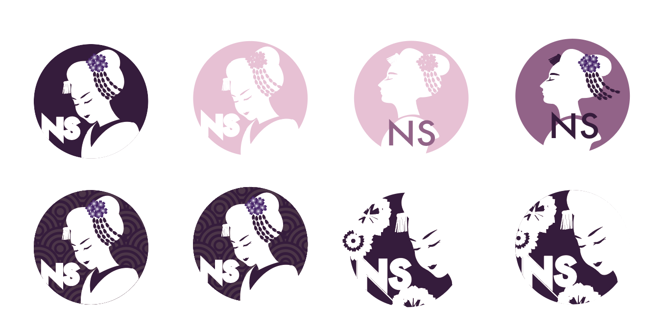
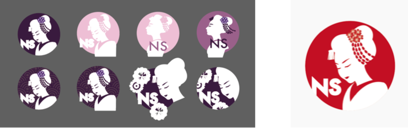
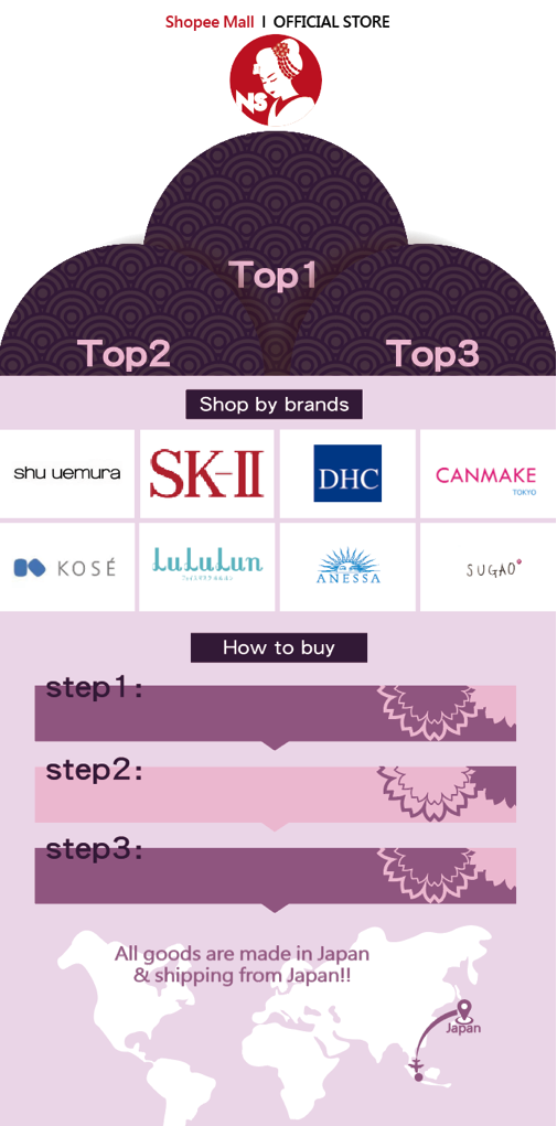
Another feature is silhouettes of Japanese ladies. Feminine faces are a common element found in
the sister brand and the Spa place. I chose the bright red on the Japanese national flag to echo
the purple-themed webpages but different enough to pop out. The bright red dot logo becomes the
symbol that best represents Japan – the sun.
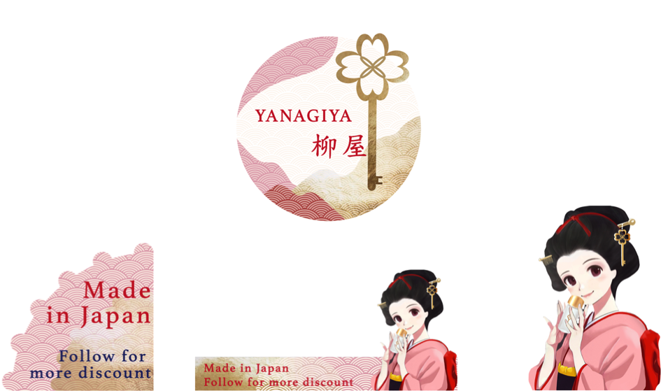
New Sister Brand
Style requirement:
Featuring anime heroines.
Target customers:
Middle-aged women.
Special requirements:
Must include a four-leaf clover keychain (the main supplier’s
logo)
Element Setting
Color scheme:
Grayish Morandi color palette. All the females are created in powdery
colors with some red highlights matched with gold to convey a sense of high-end sophistication.
Featuring female anime characters who also give off an air of sophistication. This is a challenge to me initially because anime usually gives people a sense of a young child. Eventually, the design is presented in a more realistic style and models after traditional Japanese dress of female adults.